

Sending statistics
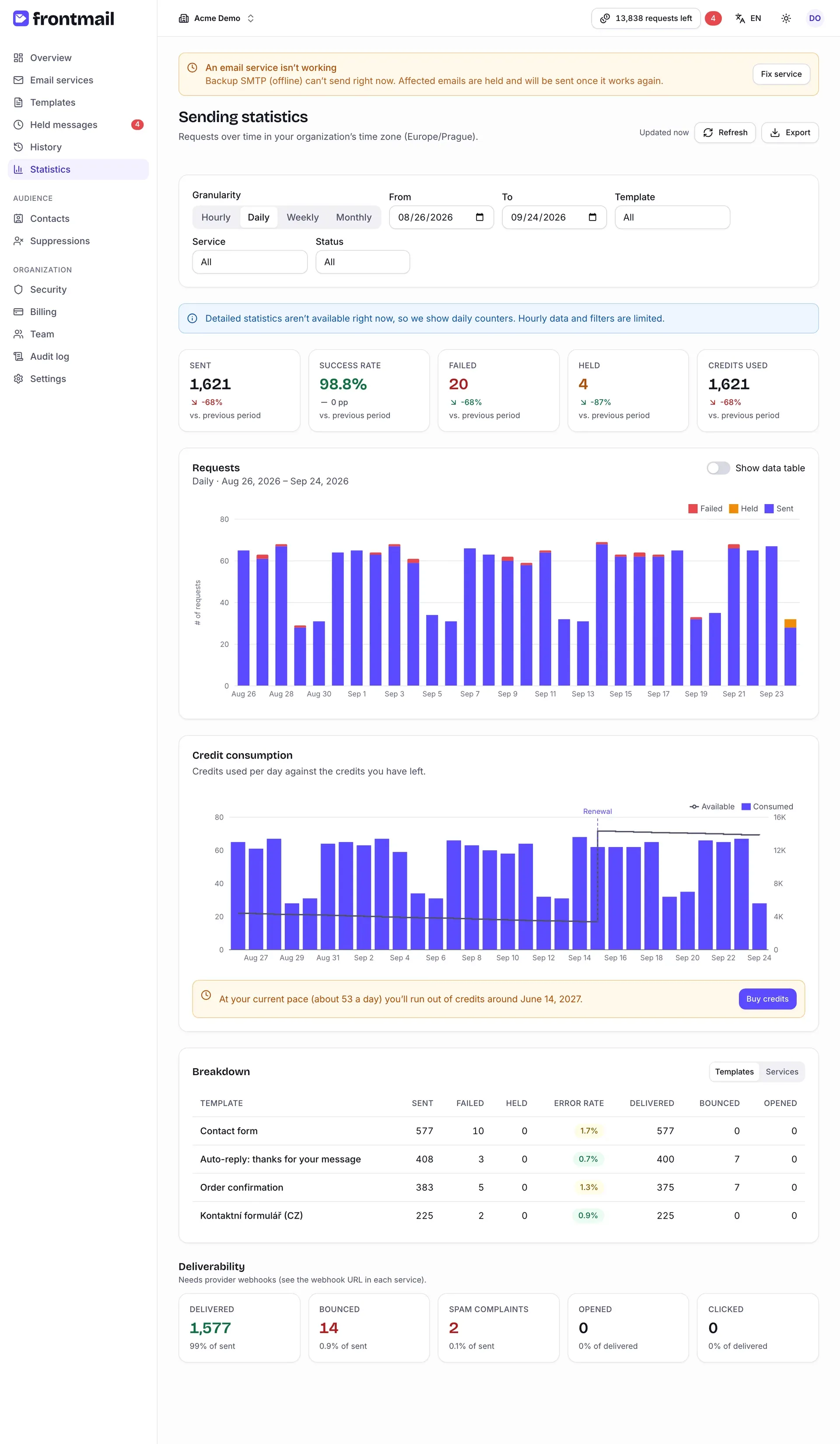
Statistics shows how much you send, how much of it works and how fast you use credits. Everyone in the organization can open it. All dates and hours are in your organization’s time zone, which the subtitle names (Requests over time in your organization’s time zone (Europe/Prague).). You can change it in Settings.
Choosing what to see
Section titled “Choosing what to see”The filter card at the top controls the page.
Granularity and date range
Section titled “Granularity and date range”Granularity sets the size of one bar – Hourly, Daily, Weekly or Monthly. Each has a default range:
| Granularity | Default range | Longest range |
|---|---|---|
| Hourly | the last 48 hours | 14 days |
| Daily | the last 30 days | about 13 months |
| Weekly | the last 26 weeks | about 2 years |
| Monthly | the last 12 months | 10 years |
How to pick your own dates
- Set From and To.
- To go back to the default, click Default range (it appears only when you’ve changed the dates).
Switching the granularity resets the dates to its default range.
Filters
Section titled “Filters”Template, Service and Status (All, Sent, Failed, Held) narrow down the KPI tiles and the Requests chart. The credit chart, the breakdown and deliverability always cover the whole organization for the chosen dates.
Key numbers
Section titled “Key numbers”Five tiles sum up the chosen period:
- Sent – emails accepted by your provider,
- Success rate – sent emails as a share of sent and failed ones,
- Failed – emails that couldn’t be sent,
- Held – emails that went to the hold queue,
- Credits used.
Under each number you see the change vs. previous period – the period of the same length right before the chosen one. The success rate changes in percentage points (pp); new means there’s nothing to compare with. The arrow is green when the change is good (more sent, fewer failures) and red when it’s bad.
Requests
Section titled “Requests”A stacked bar chart of Sent, Held and Failed emails per hour, day, week or month. Hover a bar to see the exact numbers.
Turn on Show data table to see the same numbers as a table – handy for copying or with a screen reader.
Credit consumption
Section titled “Credit consumption”Bars show the credits Consumed each day, the line shows the credits Available. Dashed markers show when credits were added:
- Pack – a credit pack was bought,
- Renewal – your subscription renewed,
- Bonus – bonus credits were added.
Hover a day to see the exact values and the event, e.g. Subscription renewed (+10,000).
Below the chart, Frontmail predicts how long your credits will last, based on your average daily use over the last 14 days:
- At your current pace (about 86 a day) you’ll run out of credits around March 3, 2027. – owners and billing members get a Buy credits button next to it,
- At your current pace your credits will last beyond this period.
To avoid running out, consider auto top-up.
Breakdown
Section titled “Breakdown”The Breakdown table splits the period by Templates or Services (switch in the top right). For each row: Sent, Failed, Held, Error rate, Delivered, Bounced and Opened. The error rate is green below 1 %, amber from 1 % and red from 5 %.
For very busy periods the table may say Based on the latest 10,000 emails only.
Deliverability
Section titled “Deliverability”Five tiles show what happened after your provider accepted the emails: Delivered, Bounced and Spam complaints (as a share of sent emails), Opened and Clicked (as a share of delivered emails).
These numbers come from your providers’ webhooks. Without a webhook they stay at zero – set it up on each service as described in Email services. SMTP, Gmail and Outlook don’t report these events.
Refresh and export
Section titled “Refresh and export”Statistics are cached for up to 5 minutes; Updated … next to the buttons tells you how fresh they are. Click Refresh to recalculate them now (you can refresh a few times per minute).
Export offers:
- Chart data (CSV) – one row per period with sent, failed, held and total,
- Chart image (PNG) – the Requests chart as an image, e.g. for a report.
Sharing a view
Section titled “Sharing a view”Everything you set on the page – granularity, dates, filters, the data table and the breakdown switch – is stored in the page address. Copy the URL from the browser to bookmark the view or send it to a colleague. The organization isn’t part of the address – the link opens in whichever organization the colleague has selected, so make sure it’s the same one.